Improving Bipi's Subscription Process: UX Analysis
Examining Bipi's UX: Competitor Analysis and Subscription Process Enhancement. Insights from user research drive actionable improvements.
Timeline
Jun - Aug 2023
PLATFORM
Web platform
MY ROLE
UX Researcher
and analyst
Introduction
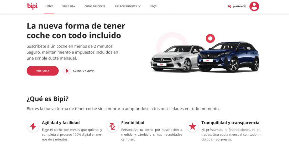
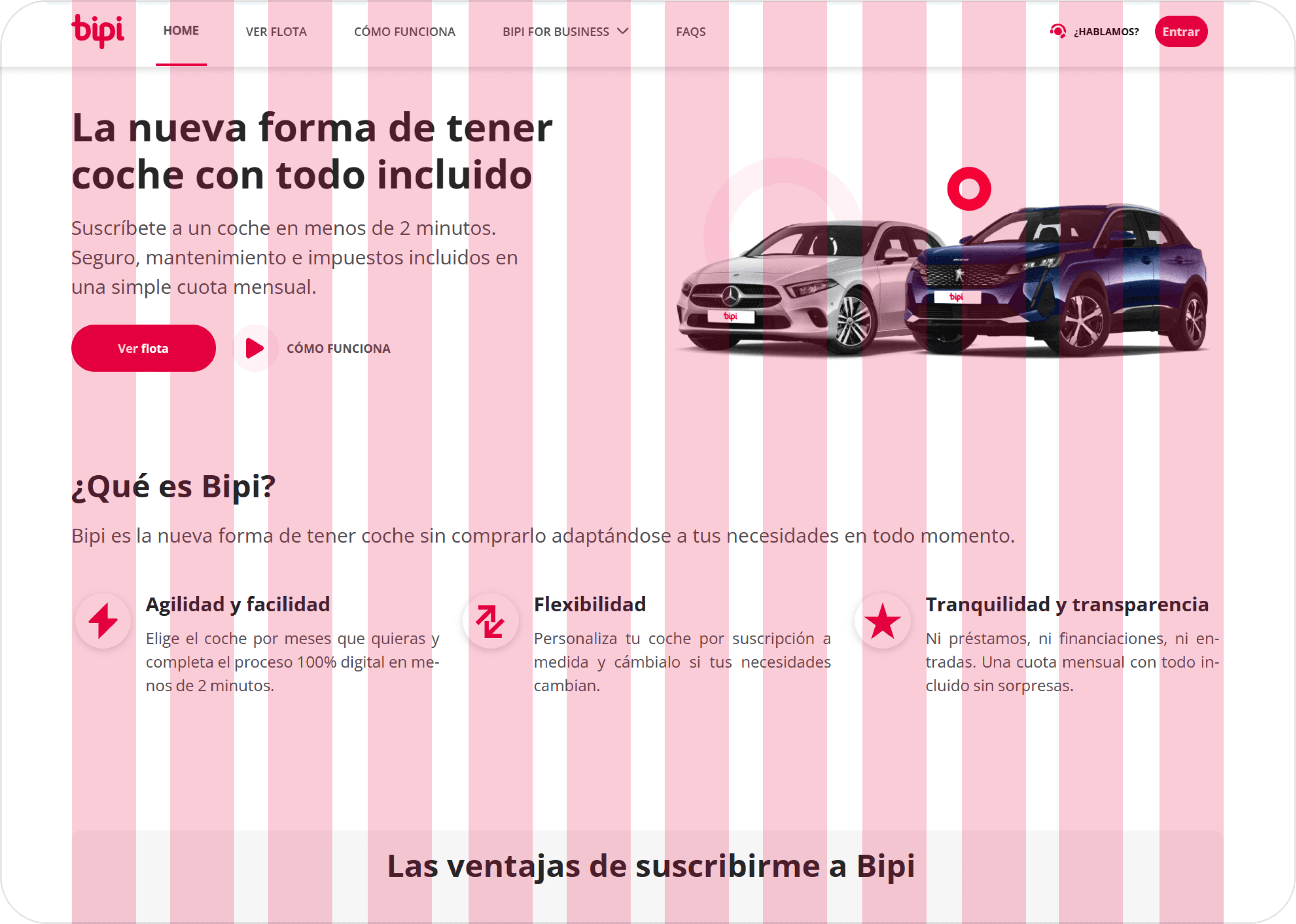
Bipi, a pioneering Spanish car subscription company, has redefined the conventional approach to car ownership. Offering users the convenience and flexibility of having a car without the burdens of long-term commitments and complex leasing procedures, Bipi has gained prominence in the evolving mobility landscape. This case study delves into Bipi's journey, examining how their subscription model, recently enhanced through acquisition by the Renault Group, brings a breath of fresh air to the world of personal transportation.
My Role
My role involves implementing UI improvements based on competitor research and user data analysis for Bipi's subscription process.
Research
Market Research: Exploring the Evolving Landscape of Mobility as a Service (MaaS)
Mobility as a Service (MaaS) revolutionizes urban transportation by seamlessly integrating diverse modes of commuting, from public transport to shared vehicles and bike-sharing, into a unified platform. This approach simplifies trip planning, booking, and payment through mobile apps or online platforms, promoting sustainable transportation choices and enhancing user experiences. Our specific focus, however, centers on the car-sharing sector, allowing us to delve into effective user communication and interface evaluations among competitors in this evolving MaaS landscape
Possible audience of Bipi
With the initial intention of understanding Bipi's audience, our team analyzed traffic data from the website. Highlighting users in the age range of 25-44 years old, predominantly male.
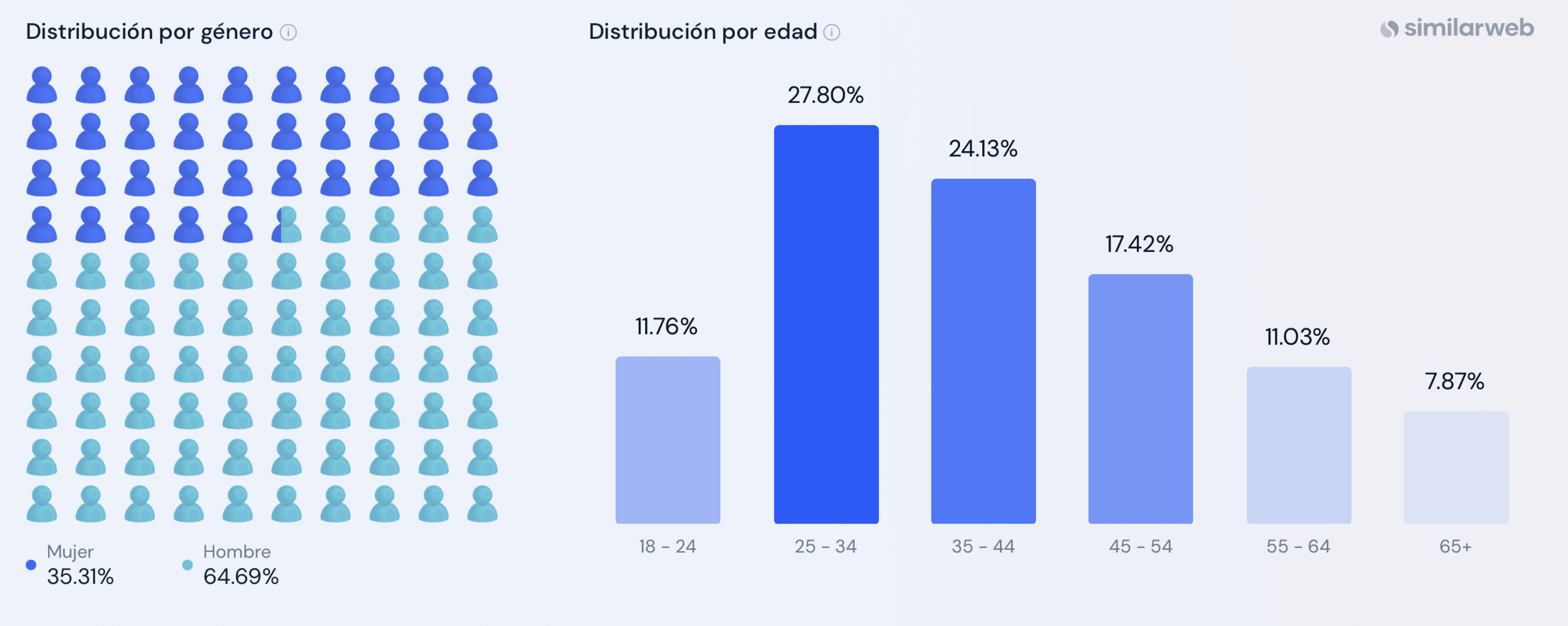
Source: Similarweb
Methodology
Our research employed a dual approach, combining Interviews and Usability Testing, conducted in tandem via remote video calls.
In-Depth Interviews
Prior to Usability Testing, we conducted brief interviews to gain insights into users' backgrounds and their previous experiences with car-sharing services
Usability Testing
During this phase, participants, selected based on specific criteria, were tasked with navigating Bipi's subscription process while vocalizing their thoughts. This process yielded valuable feedback and insights, shedding light on user experiences and preferences
Participant Criteria
Participants exhibited some degree of familiarity with car-sharing services.
Ages ranged between 28 to 44 years old, ensuring representation from our target demographic.
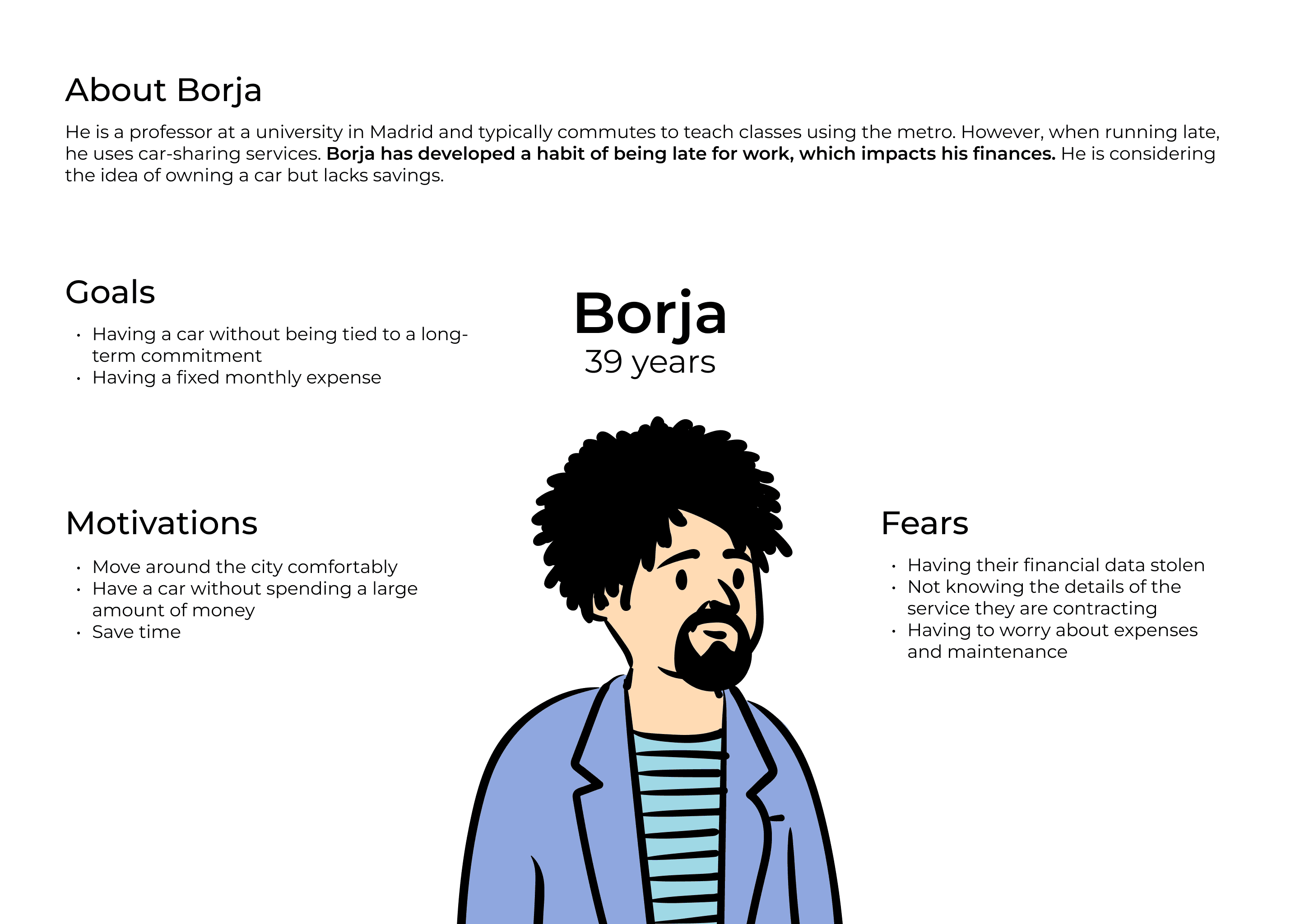
User Persona
Key Findings
Key findings revolved around usability concerns, including navigation, clarity in data sharing, and a desire for more transparent information. This multifaceted approach proved instrumental in shaping actionable recommendations to optimize Bipi's user experience.
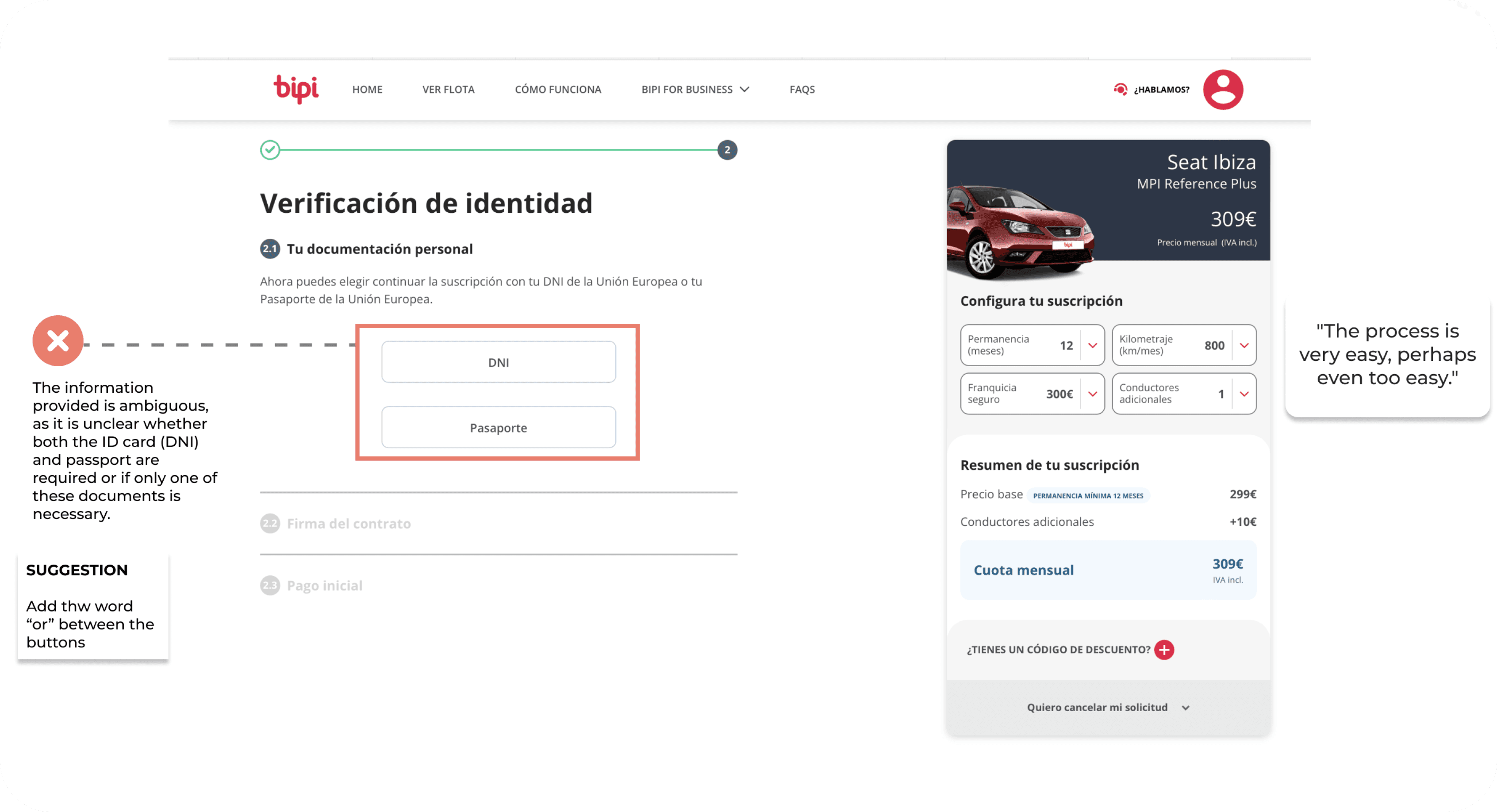
Match between the system and the real world
They use the term 'Fleet' to refer to their catalog of vehicles, which creates confusion
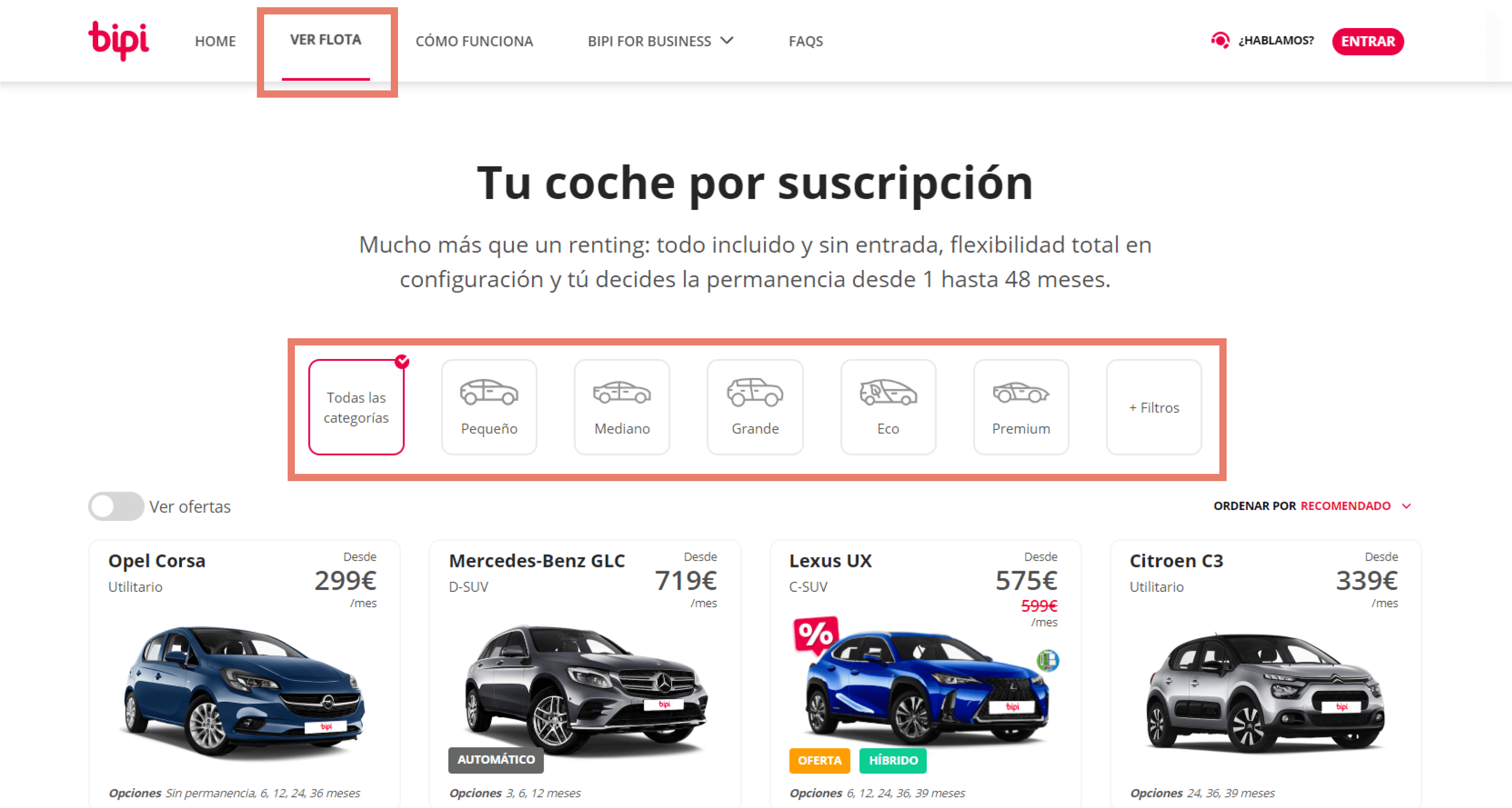

The lack of a duration filter option makes it challenging for users to search for the ideal vehicle
It's not aligned with users' mental model and generates confusion
Aesthetic and Minimalist Design
It features a simple design, it doesn't generate noise or confusion when navigating.
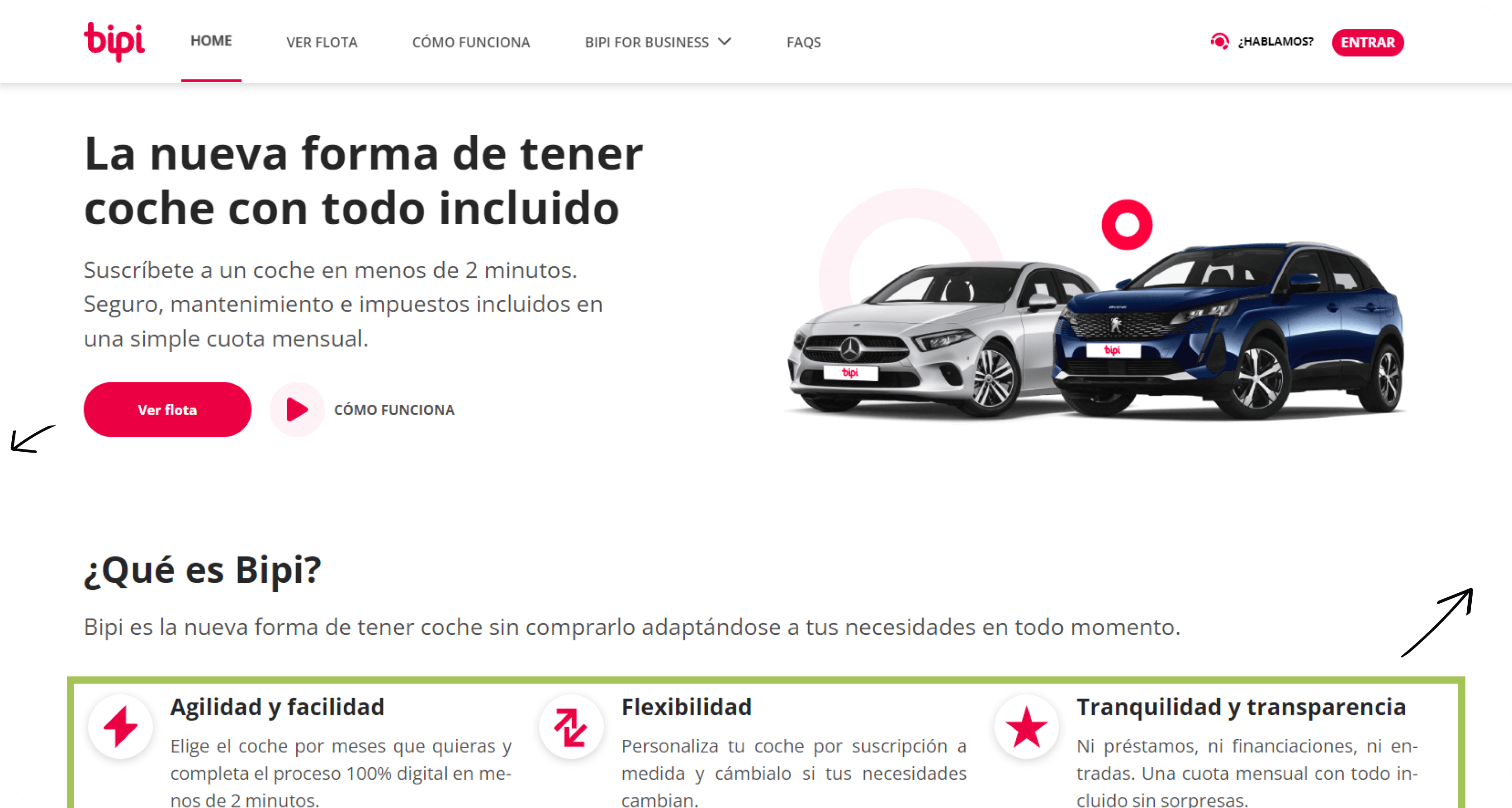

This information helps users to understand Bipi service.
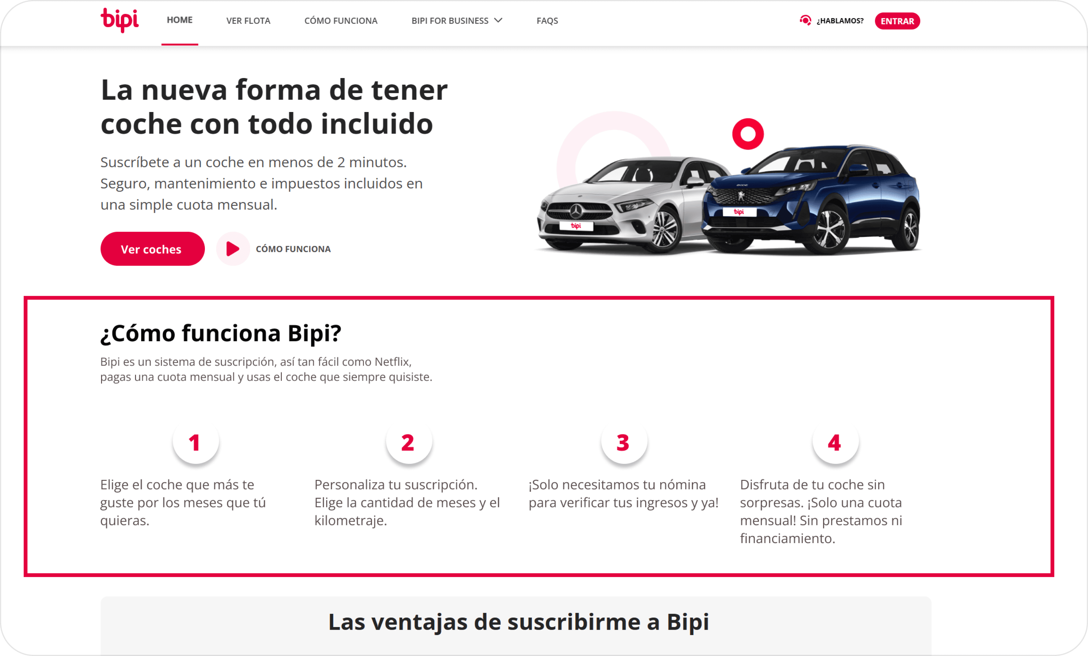
System Visibility
During the subscription process, the system displays the user's current status and the steps they have yet to complete at all times
System Visibility
During the subscription process, the user is provided with real-time updates on their progress and the remaining steps
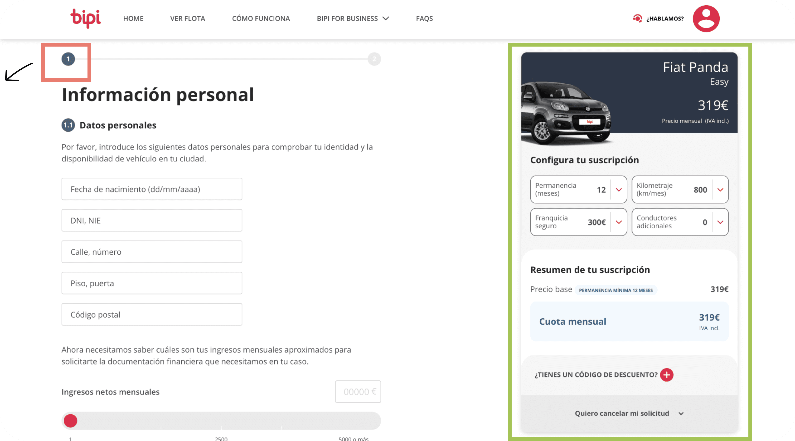
The user has all the information regarding their order
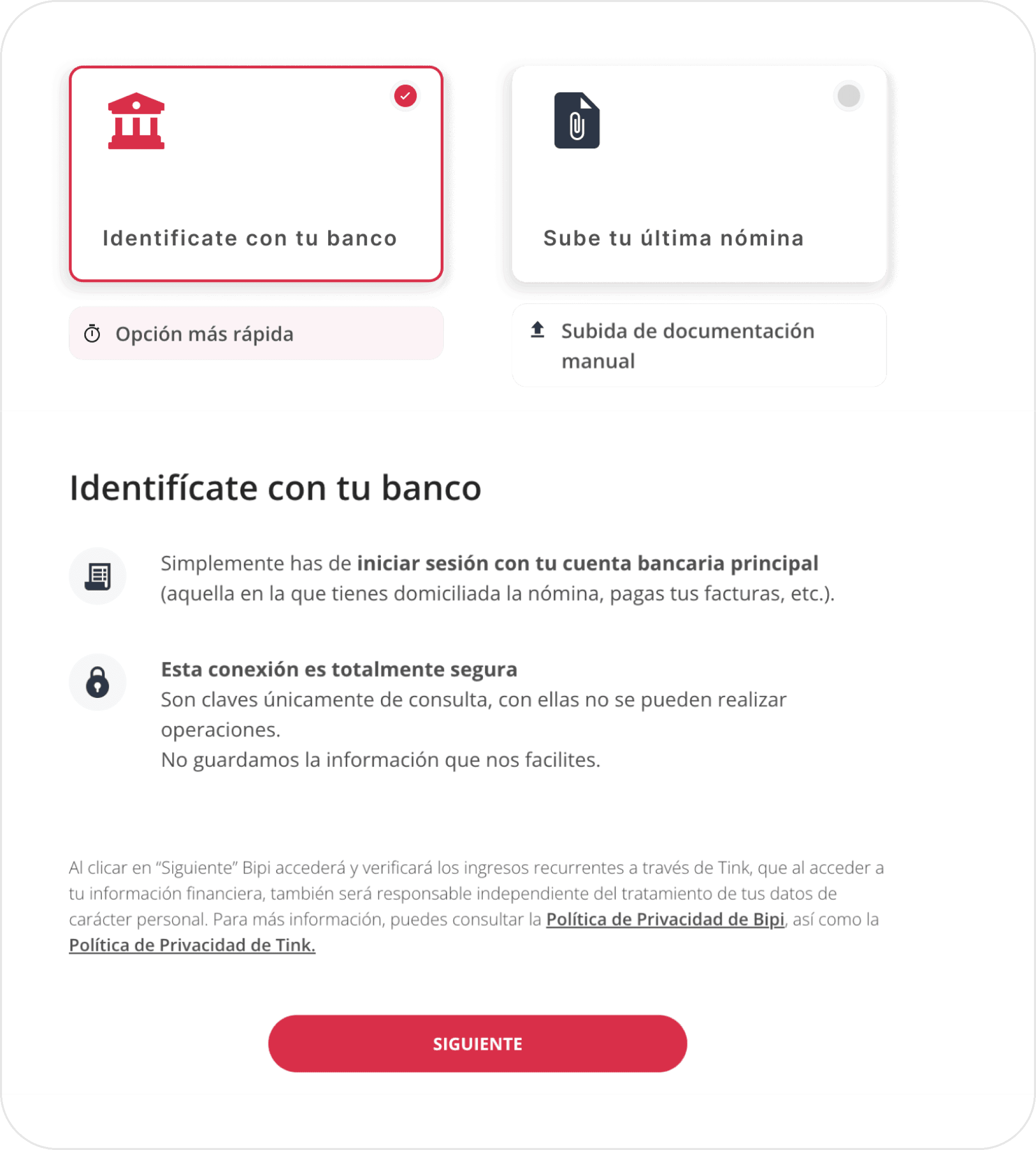
The user cannot review the previous step as there is no information available, creating the need to remember what was done before.
Recognition is better than recall
The user can know the information provided and also the settings of the chosen car
Conclusion
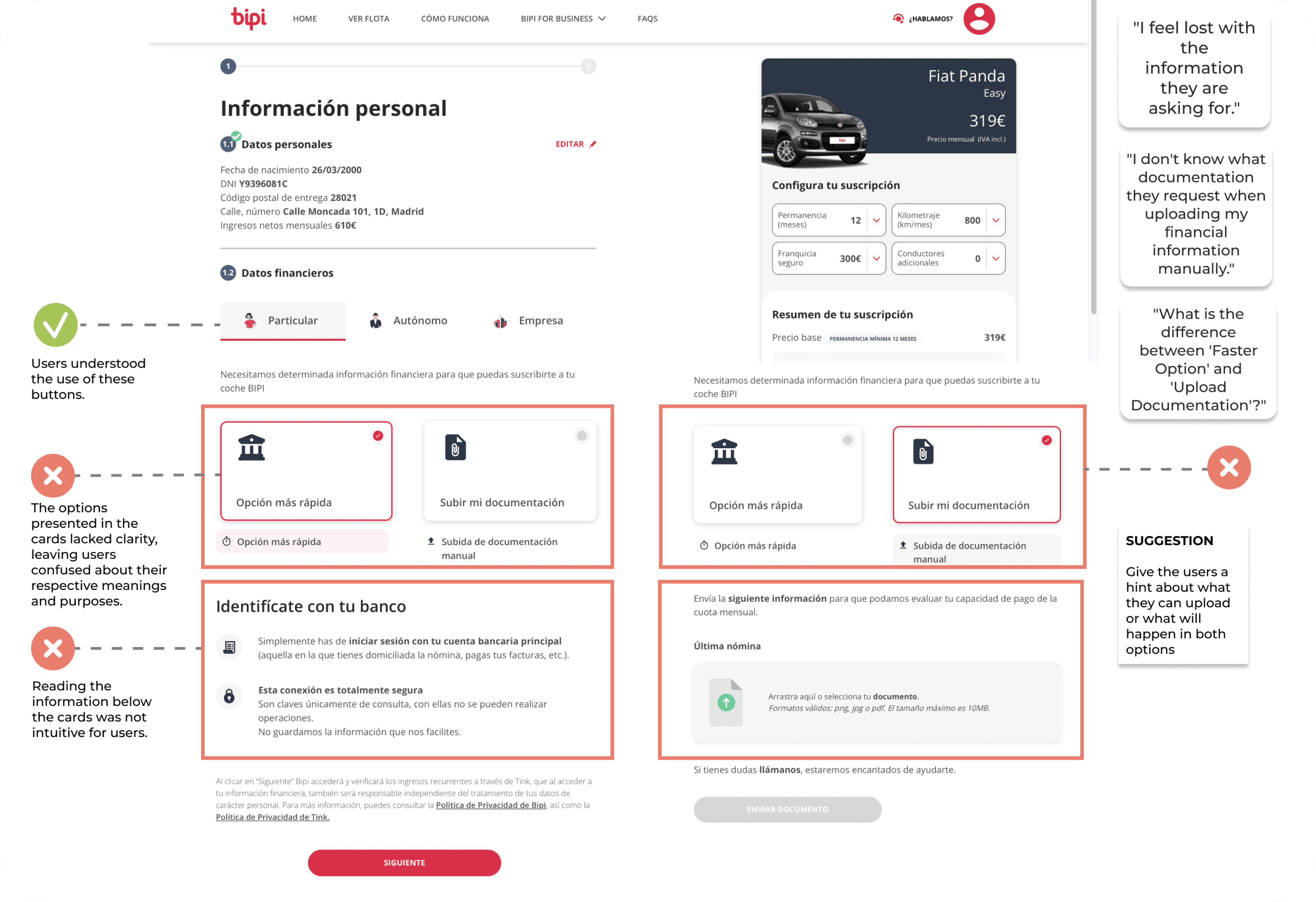
Enhancing User Clarity for Improved Conversions
The research uncovered a critical issue: the absence of essential information significantly impacting the user experience on the Bipi website. Users encountering a lack of crucial details felt disoriented and insecure, often resulting in premature exits from the platform. Notably, during Step 1, users struggled to comprehend available financial options, despite explanations provided above the cards. The unintuitive presentation of information added to user confusion. In light of these findings, it becomes clear that enhancing user clarity is paramount for achieving higher conversion rates on the Bipi website
Recommendations
Providing Clarity: Bipi's simplified subscription process, while efficient, may leave users wanting more information. It is recommended to offer comprehensive details to instill confidence in users.
Alignment with User Mental Model: Based on a heuristic evaluation, aligning the "Ver Flota" function with the user's mental model is advised. Testing this alignment can enhance user navigation.
Financial Information Transparency: To enhance user understanding, consider incorporating concise explanations for each financial option.
Subscription Type Filters: Testing a new filter system focused on subscription types (e.g., 6 months, 12 months) can provide users with a more tailored experience.
Iteration
Enhancing User Interface (UI) Based on Key Findings
In this phase, our focus shifts towards implementing solutions derived from the key findings of our research. We aim to optimize the user interface (UI) to address issues related to clarity, information presentation, and overall user experience. The iterative process will involve refining design elements, enhancing text, and incorporating user-centered improvements based on user feedback. Our objective is to create a more user-friendly and intuitive interface that aligns with the specific needs and preferences of our target audience.
Typeface
Opensans
Open Sans is favored for its simplicity, making it suitable for various applications, from web content to print materials, where clear and modern typography is essential for effective communication
Aa
Opensans Bold for heading
Aa
Opensans Bold for button
Aa
Opensans Bold for body
Colors
Primary
#E4003E
Secondary
#F6F6F6
tertiary
#00000
Ui Elements
Grid
12 columns - 24 gutter - 174 margin
On Boarding
Re-write texts to explain how to improve the Bipi subscription process
Cards
The proposal suggests highlighting the selected cards with a color detail, and, more importantly, improving the text within them to be specific about the required documentation
Progress bar
Add a progress bar to indicate to the user at what stage of the process they are.

Next steps
It is proposed to consider the idea of adding a progress bar so that the user always knows at which stage of the subscription process they are.
It is recommended to conduct a round of user testing to observe how users react to the new changes implemented.
“Thank you for reading through! Hope you enjoyed learning about my design and thought process. :) “